Last Updated on February 20, 2026
Setting up a nursery is one of those projects that starts with a sweet idea and then turns into a hundred tiny decisions. Paint colour, cot placement, storage, lighting, the list goes on. One detail that can pull the whole space together is a name sign. It’s personal, it photographs beautifully, and it can still work when your baby becomes a toddler with opinions.
We make custom pieces in our workshop, and we’ve noticed that the best results usually come down to a few practical choices, size, material, and how it’s mounted. If you get those right, the sign looks intentional rather than like an afterthought.
Why a nursery name sign works so well
A name sign gives the room a “this is their space” feeling without needing lots of décor. It also works in different nursery styles, modern, coastal, boho, classic, you name it. If you keep the colour and finish simple, it’s easy to refresh the room later with new bedding or prints without replacing the sign.
Start with the wall and the viewing distance
Before you pick a font or finish, stand in the doorway and look at the wall where the sign will go. That viewing distance matters. If you can’t read the name easily from the doorway, the sign may be too small or the font may be too thin.
Quick size guide (mm and cm)
- Above a cot: around 600 to 900 mm wide (60 to 90 cm) often suits, depending on wall space.
- Above a change table or dresser: around 400 to 700 mm wide (40 to 70 cm).
- On a door: around 250 to 400 mm wide (25 to 40 cm), with a simpler font.
These are not strict rules, but they’re a helpful starting point. If you have wall shelves, wall hooks, or framed prints nearby, leave breathing room so everything doesn’t fight for attention.
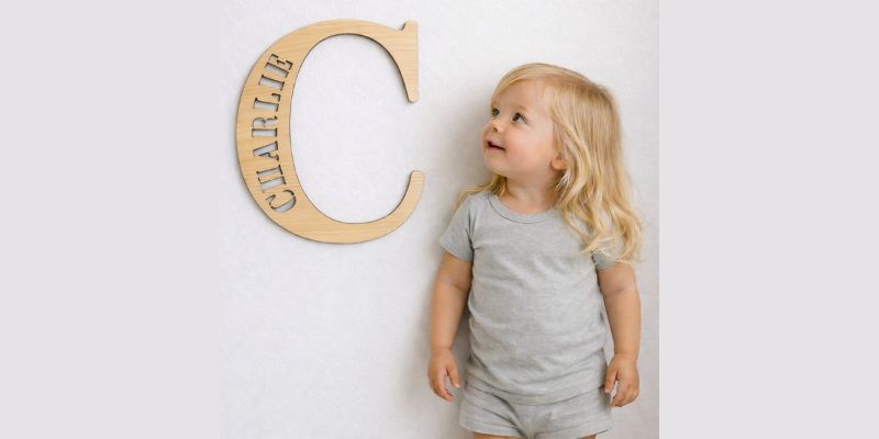
Materials that suit real family life
The two most popular choices we work with are acrylic and timber.
Acrylic (including mirror acrylic) is smooth, crisp, and easy to wipe. It can look very clean in modern nurseries. Mirror acrylic is beautiful, but it does show fingerprints, so it’s better placed higher up.
Timber (like plywood or MDF) brings warmth. Plywood shows a natural grain and feels softer in the room. MDF is very smooth for painted finishes, but it’s best for indoor use only.
A small tip from the workshop, if you’re matching a theme, take a photo of the wall colour in natural daylight, then pick a sign colour that is a couple of shades darker or lighter. The gentle contrast helps the name stand out in photos.
Around the middle of planning, some parents like to browse a few styles before choosing. If you’re comparing different nursery name signs and want to see common sizes, fonts, and finishes in one place, have a look at these nursery name signs to get a feel for what suits different nursery looks.
Fonts and spacing, the part most people forget
Most “it looked bigger online” moments happen because of font choice. Very thin script fonts can disappear on busy wallpaper or darker paint. A bold script or a clean print font is usually easier to read.
Keeping names readable
- If the name is longer than 8 letters, consider a simpler font or a slightly larger size.
- Watch letter spacing on joined script fonts, some combinations like “ll” or “mm” can turn into a blob if the strokes are too thick.
- If you add a second line (like a surname or a middle name), keep it smaller and in a plain font so the first name stays the hero.
If you’re ordering custom, always check the proof carefully. A proof is the design mock-up you approve before the sign is made. Look for spelling, capital letters, and whether the letters feel too close together.
Mounting options that feel secure
A sign should look like it belongs on the wall, not like it’s balancing there. These are common mounting choices:
- Holes and screws: Great for heavier pieces and very secure.
- Standoffs: These hold the sign slightly off the wall and can look really polished, especially with acrylic.
- Adhesive strips: Handy for lightweight signs and rentals, but only if the wall surface is clean and smooth.
- Hanging (string or fishing line): Works for lighter timber pieces, especially on hooks.
If the sign is going above a cot, we always suggest mounting it properly and keeping it high enough that little hands can’t reach it as your baby grows.
Read More – BusyPuzzle — eco-friendly wooden toys and puzzles for a happy childhood
Common mistakes, and how to avoid them
A few things we see often:
- Ordering before measuring. A tape measure saves so much stress. Mark the width on the wall with painter’s tape to check the scale.
- Choosing a font that looks pretty but reads poorly. If you can’t read it quickly, it won’t feel right in the space.
- Not thinking about lighting. Mirror acrylic can reflect lamps and windows. Matte acrylic or painted timber can be calmer.
- Skipping the proof check. It’s the last chance to catch spacing or spelling issues.
- Forgetting packaging and shipping realities. Custom signs can be delicate, especially thin scripts. Good packaging matters, and if you’re ordering within Australia, allow a bit of buffer in case couriers handle boxes roughly.
A nursery name sign is a small decision that can make the room feel complete. Keep it readable, choose a finish that suits your lifestyle, and mount it with care, and you’ll have something that still feels special long after the newborn stage.