
Last Updated on September 27, 2026
Every buying guide for gemstones assumes comparison is possible. You are given axes, told which end of each is better, and left to trade them off against each other. It is a system built for materials where two examples can be meaningfully ranked.
Moss agate breaks that system completely. Two stones of identical size, cut, and origin can look like entirely unrelated objects, and there is no scale on which one is objectively superior. What you are doing is closer to choosing a photograph than grading a diamond, and almost nobody explains how to do it well.
Why the usual framework does not apply
Gem grading exists to make stones fungible. If a stone can be described precisely enough, it can be bought without being seen, traded against an equivalent, and valued against a broad market. That is enormously useful and it is why the system exists.
It depends on the variation between stones being small and measurable. Two stones of the same species, color grade, and clarity grade really are close to interchangeable, and the grade captures nearly everything that matters.
With moss agate, the variation between stones is the entire point, and none of it is measurable. There is no unit for how well a dendritic pattern is composed. The features that make one stone memorable and another forgettable are exactly the features no grading system was built to capture.
So the practical skill is not learning a scale. It is learning what to look at, and then trusting a judgment that has no external validation. That is uncomfortable, and it gets easier with a vocabulary.
What is actually happening inside the stone
The green forms are mineral inclusions, usually iron or manganese compounds, that grew into branching structures while the surrounding chalcedony was forming. The word for these shapes is dendritic, and they are the same self-similar branching that produces frost on glass, lightning, and the tributaries of a river.
This is worth knowing because it explains what you are seeing. The patterns look organic because they were produced by the same physics that produces organic branching, not because anything organic was present. There is no fossil in a moss agate.
It also explains the variation. Branching structures are extremely sensitive to the conditions they form under, so small differences in temperature, chemistry, and available space produce dramatically different results. That sensitivity is why no two stones repeat.
And it explains why the green cannot be removed or damaged by ordinary wear. These structures run through the body of the stone rather than sitting on its surface.
Where the material comes from
Moss agate is not geographically scarce, which is part of why it remains accessible despite every stone being unique. It forms wherever silica-rich solutions percolated through rock carrying the right trace metals, and that has happened in a lot of places.
Montana is the best-known source and produces material with a particular character, often warmer and more richly patterned, sometimes with strong rust and red tones alongside the green. India is the largest commercial producer, and Indian material tends toward crisp green dendrites in very clear backgrounds. Brazil, Uruguay, Indonesia, and Australia all contribute.
Unlike stones where origin drives value, moss agate is judged almost entirely on the individual piece. A superb Indian stone beats a mediocre Montana one comfortably, and origin claims in this category are more often descriptive shorthand for a look than a statement about provenance.
What origin does usefully predict is character. If you have seen a stone you loved and want something similar, knowing where it came from narrows the search considerably. Studios that select their own rough, such as the Aquamarise site, can usually tell you which material they favor and why.
Reading a stone like a composition
The most useful shift is to stop evaluating the stone and start reading it the way you would read a picture.
Look first for a focal point. Stones that hold attention usually have one area where something is happening, with quieter regions around it. Stones where the inclusion is evenly distributed edge to edge tend to read as texture rather than image, which is calmer but less memorable.
Then look at the movement. Dendritic structures have direction, and a stone where the branching sweeps across the face has an energy that a static, symmetrical distribution does not. Neither is better, but they produce very different objects.
Finally, look at the negative space. The clear areas do as much work as the green ones, and stones with generous clear regions look deeper and more three-dimensional than densely packed ones. Beginners consistently over-value density and under-value space.
Scale changes everything
A pattern that looks spectacular in a photograph of a rough slab can be illegible once cut down for a finished ring, and this catches people out constantly.
The reason is simple. Dendritic structures have a natural scale determined by how they formed, and cutting a small stone from a large piece does not shrink the pattern, it crops it. Fine, delicate branching reads beautifully in a small stone. Bold, large-scale branching cropped into a small piece often reads as a couple of unrelated green blobs.
The practical test is to look at the stone at the size it will actually be, not magnified. Almost every listing shows moss agate enlarged, because the detail is the selling point, and almost every buyer forms an impression at a scale they will never see again.
If a seller only offers extreme close-ups, ask for the stone photographed on a hand. The difference between the two images tells you most of what you need to know.
The window problem
Translucent stones with large clear areas have a property that photographs never capture: you can see through them, and what you see is whatever is behind them.
On a hand, that means skin. A stone with generous clear regions will pick up the tone of the finger underneath, which warms the whole stone and can shift how the green reads. This is usually flattering and occasionally not, depending on how the stone was photographed. Studio images are typically shot on white or on a light box, which shows the stone at its coolest and clearest.
The effect is strongest with flat, open cuts and weakest with domed cabochons, which scatter more light internally. It is also strongest in the thinnest parts of the stone.
None of this is a defect, and many people prefer the warmer on-hand appearance. It is simply worth knowing that the stone you receive will look slightly different from the stone you saw, in a predictable direction.
The colors that are not green
Most descriptions treat moss agate as a green stone, and most stones contain considerably more than green.
Rust and amber tones are common, produced by iron in a different oxidation state, and they often appear as a warm haze around the green structures. Grey and near-black inclusions turn up frequently. Some material carries a faint blue or lavender cast in the clear areas.
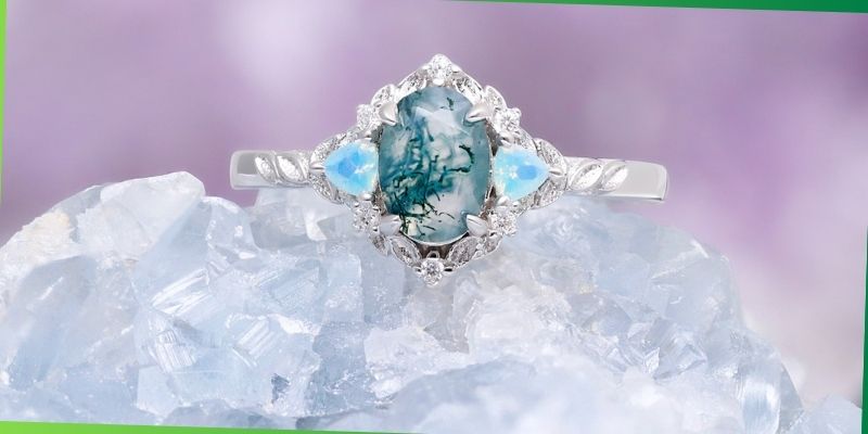
These secondary colors are the single most useful thing to notice, for two reasons. They are what makes one stone feel warm and another feel cool, which affects everything about how the finished ring reads. And they are the key to accent and metal choices, since an accent that echoes a secondary tone already present in the stone will look deliberate in a way that an imported color never does.
Look at the stone in daylight to see these properly. Warm indoor lighting exaggerates the rust tones and can hide a cool cast entirely.
Orientation is a real decision
An asymmetric pattern has a right way up, and it is not always obvious. The same stone rotated ninety degrees can go from reading as a landscape to reading as an abstract.
Good cutters and setters think about this. The orientation gets chosen so the composition works with the shape of the stone and the direction the ring will be seen from, which is usually from the wearer’s side rather than head-on.
It is worth asking about, because it is one of the clearest signals of whether anyone was paying attention. A studio that can tell you why a stone is set the way it is has almost certainly made other good decisions about that piece.
If you are commissioning, it is also worth saying which orientation you prefer. It costs nothing to specify and it is impossible to change later.
Matching a stone to a person
Since there is no objective ranking, the useful question is not which stone is best but which stone suits the person wearing it.
Busy, high-contrast stones with strong movement are conspicuous. They draw comment, they read from a distance, and they suit someone who wants the ring to be a thing people notice. Quiet stones with sparse inclusion and large clear areas are the opposite, and reward the wearer more than the audience.
Warm-toned stones with rust and amber sit comfortably with vintage-leaning taste and warm metals. Cool, grey-green stones with crisp branching lean modern and take cool metals well.
None of this is prescriptive. It is a way of narrowing an unrankable field to a few candidates, at which point the decision is simply which one you keep coming back to.
Choosing when you are buying a set
Buying more than one piece at once introduces a constraint that single-stone buyers never face: the stones have to look related.
Because no two are identical, matching is impossible, and pursuing it produces disappointment. What is achievable is coherence, meaning stones that share a temperature, a density, and a general character even though their patterns differ completely.
This is genuinely difficult to do from separate listings, which is why coordinated moss agate engagement ring set designs are usually assembled by somebody holding the stones side by side. A warm, dense stone next to a cool, sparse one will look like an accident no matter how good each stone is individually.
If you are building a set across separate purchases, buy the largest stone first and match toward it. Working in the other direction almost never succeeds, because the center stone is the one with the least flexibility.
Buying from photographs without regret
Most of these purchases happen online, which means the whole decision rests on images. A few habits substantially improve the odds.
- Insist on the actual stone. Stock photography is meaningless for a unique material. If the listing does not show the piece you will receive, it is not telling you anything.
- Ask for daylight. Studio lighting is uniformly flattering. Daylight shows secondary colors and true contrast.
- Ask for it on a hand. Scale and the window effect only appear in context.
- Look for multiple angles. Translucent stones change substantially with viewing angle, and a single flat image is the least informative version.
- Watch for oversaturation. Greens are easy to push in editing. If the green looks more vivid than any stone you have seen in person, it probably is.
When to walk away
Some stones are genuinely worse, even without a grading scale, and the signals are consistent.
Cloudiness in the clear areas kills the depth that makes the material work. If the background is milky rather than translucent, the inclusions sit on a flat field and the stone looks dull regardless of how good the pattern is.
Surface-reaching fractures are worth avoiding in any stone destined for daily wear, and they are visible if you look at the stone at an angle under a light rather than straight on.
And a pattern that is genuinely chaotic, with no focal point and no restful space, tends to wear badly on the attention. It looks striking for a week and busy thereafter. This is subjective, but a stone you find slightly overwhelming in a photograph will not become calmer in person.
Read More – 10 Best Sweet Perfumes For Women
The short version
Look at the stone at actual size, in daylight, on a hand. Pay attention to the clear areas rather than only the green. Notice the secondary colors, because they will drive every other decision about metal and accents. Check that there is a focal point and somewhere for the eye to rest.
Then stop analyzing. Unrankable objects are chosen, not calculated, and the stone you keep returning to is the correct answer by definition. That is not a lowering of standards. With this material, it is the only standard that has ever meant anything.